Fifty shades of...blue

Sometimes it is so hard to find the right color shade for your cabinets that it's advisable and actually cheaper to pick one form a RAL color chart and paint the doors.
Whenever you might be tired of it, you could paint over again.
That's what we did last year for this kitchen.
First of all, it ought to find the right type of door. That should be without protecting coating.
The best door suggested by the IKEA staff was HÄGGEBY. That's a plain door without coating and with no frame. A plain door which frankly lacked of character.
We opted for doors with a frame:
BODBYN and TORHAMN.


These were the chosen colors


We sanded the doors to remove the protecting coat.
Then we applied the color with a brush. Here is the effect on the first door.
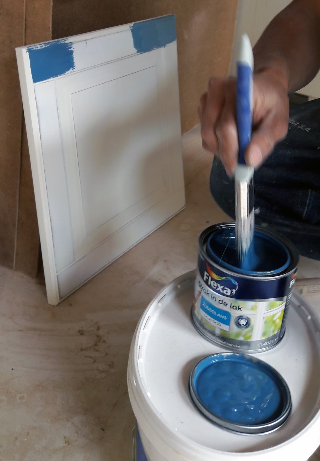

This door has got quite an elaborate molding, quite difficult to sandpaper.

The second door has a real wooden frame which allow you to see wood grains through the paint and a synthetic pane.
Confronting the paint with the samples:

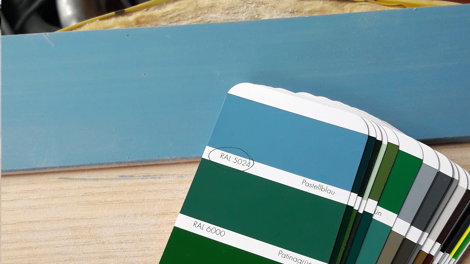
Neither of the two colors was convincing enough because both were too bright. So we took another shade

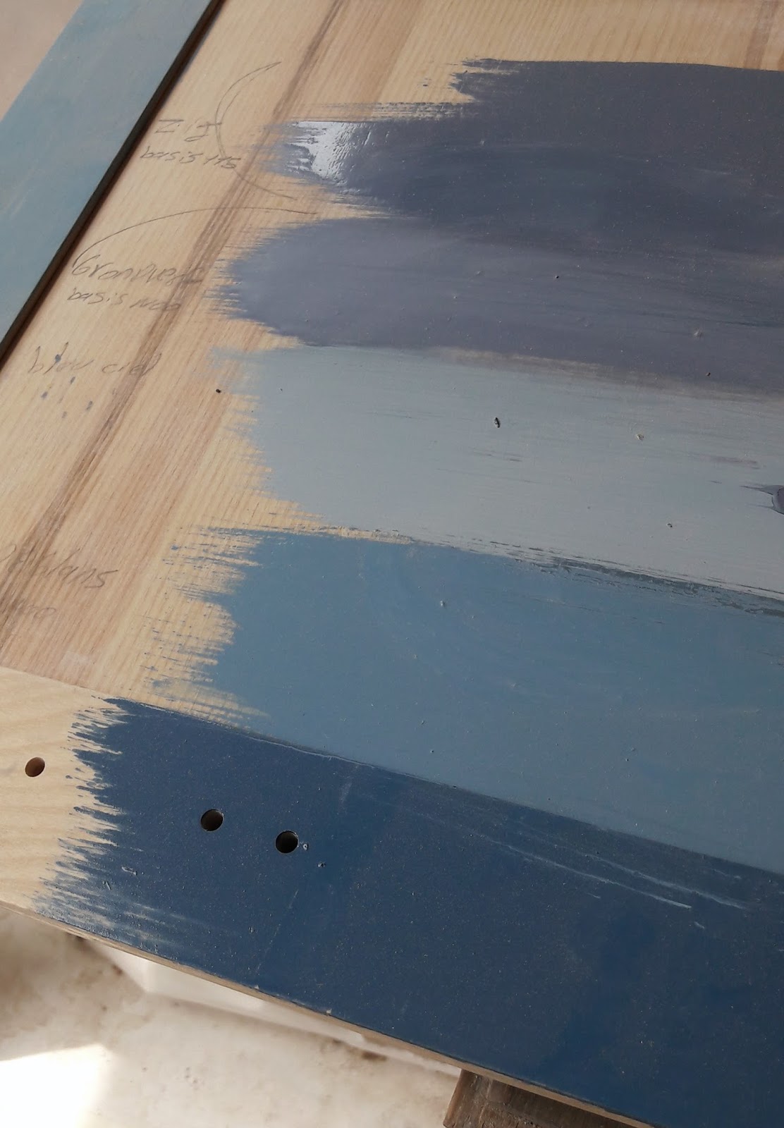
Here is the test.

Then we reviewed again all the options, adding a layer of primer underneath in the same shade and another type of paint called krijtverf (chalk paint, lighter in the middle).
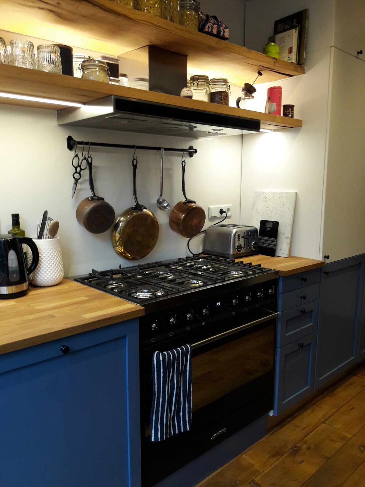
Here is the final result. Every door was sanded, then spray-painted with primer RAL5014 and lastly with the top coat stain gloss.
There is no mat varnish available when the paint is oil-based. A water based paint wouldn't have sustained the usage.

We kept the pigeon blue only for the lower doors and drawer fronts. Every door above the counter top is a VEDDINGE Ikea door, matte white. It would have been too dark with all the doors in blue. In this way the horizontal lines acquire strength, making the kitchen look longer.


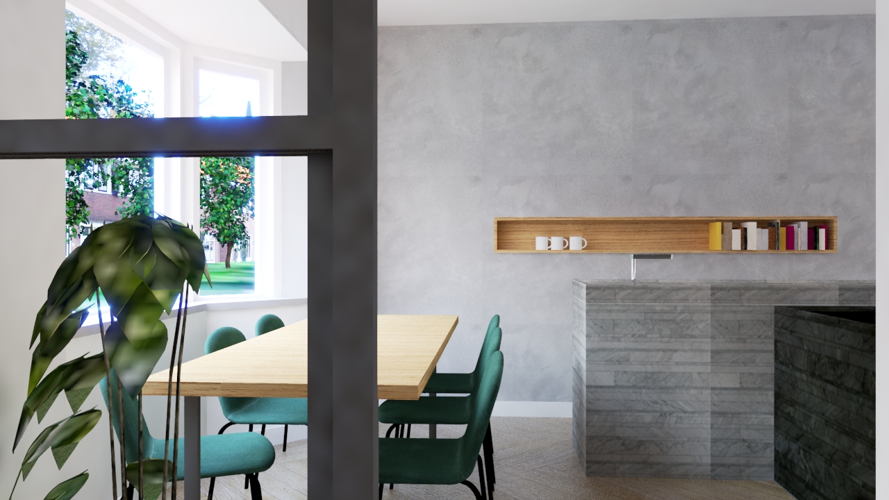
More pictures of the house here.